


I h a v e a c o n f e s s i o n t o m a k e : I can be a punk. What I mean by that is, I have been known to ignore good advice because I think I know better. Deep down, I hope that’s something we all need to confess from time to time - but who knows, it may just be my status as a mere mortal.
Now, I can’t make a confession and then not provide an example, but we’ll get there. As you’ve already gathered from the title of this post, I am going to be talking some more about color theory. If you missed the first part of the series, you can read it here.
I was excited when Hannah, the owner, included a link to a video by Lisa Clough, the artist behind Lachri Fine Art, in her newsletter this week. If you don’t already receive the newsletter, you’re missing out on all Dynamic Distractions behind-the-scenes content; I recommend you sign up here at the bottom of the page.
I have been a fan of Lisa’s for a while, and I credit her with improving my painting technique almost over night. You would think I would defer to her advice on almost everything, right? But alas, I am a punk...
That brings me to today’s topic: Using black and white paint to enhance color mixing.
---
T H E M Y T H S W E A L L B E L I E V E A T
S O M E P O I N T :
A D D B L A C K P A I N T T O M A K E
A C O L O R D A R K E R
B e l i e v i n g t h i s m y t h is why my friends and I were led to believe that the colors green and purple were evil in high school. When we added black paint to create a darker green, we got an ugly muddy mess; when we added white, it produced a miserable cloudy pastel.
Now there are going to be some exceptions to what I am about to tell you, but I promise this will work better than your reliance on good ol’ black paint. For those of you shouting at the screen saying that black paint out of the tube shouldn’t exist all - your point of view will be recognized in due time.
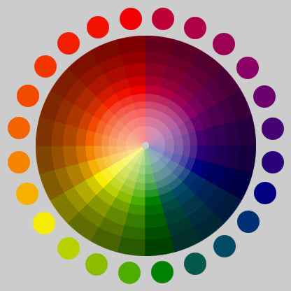
Remember our friends, the color wheel and complementary colors? While complementary colors provide a good guide for aesthetically pleasing companions, they serve - what may be - a more important function: adding a color’s complementary color creates a harmonious darker hue of the color. For example - instead of adding black to our shade of green, we should have added red.

For some colors, black will be the right answer - or at least not the wrong one - but that will be the exception and not the rule.
I practice what I preach and below are some swatches I created for a painting I am working on. They aren’t pretty (yours don’t need to be either), but the swatches are made to make your life easier, not to create more work. I created scales using black and white with my base colors (pyrrole red and phthalo green) and a swatch scale that combines the complementary colors in different ratios. If you’d like me to discuss my ratio notations, let me know in the comments below. You’ll notice I struggled with the opacity of the green a bit; I will discuss how I overcame that problem in a future post.

Protip: Like my (mostly) crisp lines? I used an angled brush like (⅜). This brush allows me to get precise lines and sharp corners, while still having the surface area to quickly fill in the square.
A L L B L A C K A N D W H I T E P A I N T
I S C R E A T E D E Q U A L
W H I T E S
Now we are getting to the center of my confession. I thought white paint, was white paint, was white paint. Watch Lisa Clough’s YouTube videos for long enough and you will hear her say multiple times that she almost never uses titanium white and almost always uses transparent mixing white. I was a titanium white purist, did I really need multiple whites? Then, there was dancing in the Lachri Art Community when Liquitex released Transparent Mixing White in Liquitex Basics.
I had to know what the fuss was about. I finally gave in and purchased a tube for myself. My life was forever shook. I was no longer prisoner to milky pastels; transparent mixing white created a lighter value without a desaturation of the color.
B L A C K S
There is a popular belief that there is no reason to ever own a tube or pan of black paint. Yes, you can mix convincing blacks, but honestly, I keep it around for convenience. What I will almost never do is apply the black straight from the tube to my paper or canvas. I like to add purple, blue, or red when using black. While this value shift is barely perceptible, it adds dimension to the color and mitigates the optical illusion that the black is dusty or not dark enough.
O O P S! T O O D A R K.
L E T M E A D D S O M E W H I T E . . .
This will be short and sweet. If you add black or white to a color, DO NOT add the other with the expectation that it will reverse the darkening or lightening. If you add black or white after you have added the other, it is the equivalent of adding gray to your color. The result will be a desaturated color, which is usually not what you are going for. If you add too much black or white, you will need to start over with fresh paint. To prevent this from happening, be very conservative with the increments in which you add the black/white.
---
I am happy to report that I am now a recovering punk - a recovering punk that has a lot less headaches due to color value issues. I spoke briefly about different options for white paint, but next I want to break down the exact differences between your white and black options and what their ideal uses are.
 B Y : B R I T T N E Y E S P I N O Z A